
Looking at a Work of Art: Rothko’s “Mulberry and Brown" Museum of Fine Art, Boston, MA Nov, 2017
This is the 2nd of my journal entries that chronicle a "slow" viewing of a single piece of art. The show was a small one showcasing works from the National Gallery in Washington, D.C. of the Abstract Expressionist, Marc Rothko on display at the Museum of Fine Arts, Boston through Sept. 2018. It was unusual in that it encompassed works across his entire career.
The entries that follow are broken into sections, each representing a step in a process for viewing developed by a group of artists/friends that I am a part of. Leslie Saul, Rochelle Seltzer, & Betsy Ann Duval also partook in the exercise.
Choosing a piece.

I chose this particular Rothko because it was somber. Also it wasn’t one of R's famous works but was still within the type or genre that I tended to connect with his name. But it wasn’t one that was “in your face” with his huge color blocks. It was quieter. Also for me the colors were more difficult to warm up to unlike some of R’s intense hues. While the combination of color was intriguing, any one of them alone wasn’t particularly engaging, at least in this first quick walk through.
First Responses: What am I looking at?
For my “first look”, I chose to spend time at 15 feet, again at 6 feet and then close up. I also decided to see what would happen with and without glasses. I wear contacts but these are calibrated for close-up work, so I add a pair of distance glasses when I want 20/20 or better vision from afar. I also did not read anything about the work (or the show), not even the title….more about that later.
At 15 ft., I am looking at an almost square canvas, or maybe it really is square but the locations of the color blocks create an optical illusion of a rectangular shape. With glasses, it appears to be a large black rectangle with a brown background. In the lower left a whitish area is visible and there is blotchiness and streaking in the entire lower section. Without glasses, the piece feels quite different. The brown background is more of a deep purplish color, maybe cordovan is the right word. The whole painting becomes much deeper in hue and intensity: much more intriguing.
At 6 ft., the lower blotchy area is more obvious and detailed. The same color switch happens as at 15 ft., with or without glasses. I am so much more drawn to the less focused versions (i.e. w/o glasses). Why is that?
Which leads to some more questions: does the work stay flat? Or do I start to see it in 3 dimensions? Does it start to move on me? Or does it stay in a flat, still, well defined plane or shape? What about this light and dark area in the lower area? What is that all about? What is it doing here?
This piece feels so emotionless for me at this point. That’s a surprise. Why am I so slow to react to this piece? I think more about the dark lines in the lower area and why they aren’t doing anything for me. The lower left blotchiness bothers me. The white dot further to the right really bothers me.
At 1 foot. Now there is so much detail! The little dribbles below the black are one example. Also the extreme matte finish of the black….it is so dead and there is no detail in that area. Then the dribbles come out from this area. THEN you get to the bottom area that is almost like it were unfinished….like done as an afterthought, very quickly.
Then I finally look at the title: "Mulberry and Brown" 1958. This is a surprise to me, because the background looked to be either cordovan or brown and the rectangle is black and still is. So the first interpretation is that R is referring to the rectangle and background by the colors he sees or is thinking that he is using. But I wonder, maybe he too saw the non-rectangle area in different hues depending both on when or from where he looked at his work. May that was his exploration. Don’t know.
Note: the up-close view coincides with when this work starts to “feel”. Only then do I start to have some real interest.
Break One: Look Around
Let’s go further into what this color thing is all about: the cordovan/brown, black and the mulberry and brown title. Why do I want the rectangle to be black and not brown? Is this painting just a color experiment? Or is there some sort of psychological aspect coming to the fore? And whose psychology? Rothko’s or mine? Do I want content? Not wanting to stay in a pure abstract mode….even though having grown up in it, I’m supposedly completely comfortable with art that doesn’t have “meaning” in a story sense. Am I going to force content on it anyway?
So I stop everything and cross the room and look through the glass doors into the glass-roofed atrium area outside the gallery (this is the modern wing of the MFA). I’m without glasses so things aren’t really in focus. The flying man was visible out over the staircase and the juxtaposition seemed relevant.

Out of focus "flying man" as I saw it.
Rather than flying, he seemed to be leaping into the air, more like just taking off. And he was doing so with great elation, hands risen. It was as if he jumped out into space with a pure faith the he would survive here or somewhere. He seemed to be leaping through Rothko’s black holes.
Break 2: Mix It Up Again
I went back and looked through the glass doors again (trying to ignore a docent’s lecture going on). This time the architecture of the atrium became the focus and some graphic squares hung straight across from the doors where I was but across on the other side of the atrium.
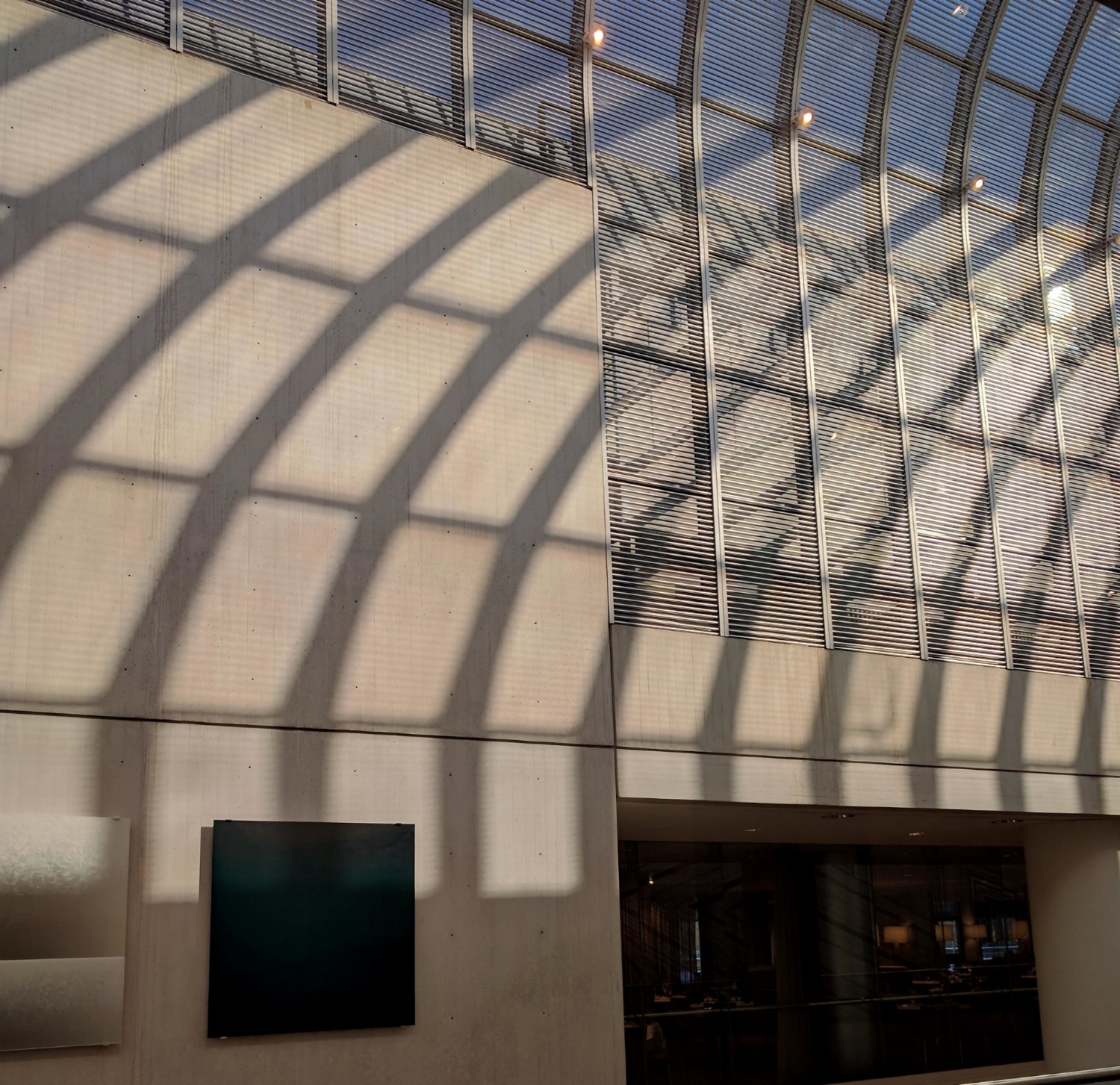
Look at all the squares: window blinds, shades. black and silver artwork!
The glass panes of the domed roof were also all squares. And it made sense for some reason to think of these two sets of squares together. Though one reason was certainly that I knew that Rothko painted a lot of these big abstract color pieces for specific sites in new buildings. It seemed to me that the architectural squares and the silver and black pieces hung near them were “easy”. They read clearly what they were about….drawing attention to some underlying structural scheme and providing a contrast in color and surface. But R’s squares were “difficult”. They weren’t just graphical studies, patterns, or intriguing juxtapositions. They challenged me with their subtlety and complexity. They even dared me to look away, ignore them, and write them off. It was hard to find their meaning, what they were supposed to be doing to and for me……honestly just like life.
Metaphors and Symbols
This painting is evolving into an entirely different viewing experience for me at this point. Now I’m fixated on the dense, matte black and I’m seeing it as a black hole as in space. I’m seeing an invitation, an enticement to merge with the murk of brown/mulberry and to return to the proverbial state of ooze that we all came from. It is an invitation to become one with something universal: to drop all the words and concepts and try to make sense of it all by becoming part of the All, even disappearing in it.
Art-making: technique, color, applications, movement, light
I note that the piece was made, according to the label, with hide glue, egg, and oil. The glue is making the super-matte flatness in the black rectangle (I’ve observed colleagues working with hide glue). That flatness….its not reflecting light…..is creating the sense that I am feeling of approaching a black hole in space. The unfinished quality of the lower area also drives the eye out of that area…..to go up and dive into the black hole.
Connections from history, literature, personal experience
I didn’t get any new insights at the time by asking the experience question. But now as I write this, I can’t help but think that all my reading and interest since I was a kid about astronomy, space, and time probably had something to do with what I projected onto this painting. So returning to the “who’s psychology are you seeing”, there definitely is a projection of myself onto this work. And this in turn is why looking at abstract art for a decent amount of time can be rewarding. 1958 was certainly in the middle of what you could call the “Freudian Age”, when the idea of projecting the subconscious held a particularly strong hold on thinking and imagination.
Looking afresh: seeing from different directions
I did look at this work from different directions, particularly from the side, almost standing against the wall. From the left, the work took on a velvety texture particularly in the black rectangle. That area drops back from the surface plane. If you look down the row of other paintings, they all stay flat and on the same plane. But this one unexpectedly starts to look three dimensional: it isn’t flat and no longer on the same plane as the other paintings. The hole (rectangle) drops away, almost out of sight.
Later I come back and looked at it from the other side…the right. Now the black hole stands out away from the brown/mulberry background. It comes forward as if reaching for you ….even more of an invitation to walk through it. I find these changing dimensions really interesting. Also it is intriguing to realize that this painting at first seemed so dead but then changed so much after looking at for a long time. That it changed so much and kept on changing is why it has come to feel like a really great painting to me.
Additional thoughts to initial questions
I have answered my questions as I’ve gone along. Except the one about whether it “moves”. And yes, it most certainly does.
The Story
This painting took me to the edge of death, the eternal, loss, and a return to ultimate solemnity.
Let me speculate: maybe Rothko wanted to explore in some pure way these feelings that we have as humans about the cosmos. Or to create an experience that would lead us to an acceptance of these feelings as normal and not fearful.